Brand Logo: 5 Tips You Need to Make Them Customer-Friendly

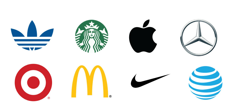
Don’t be deceived, customers judge books by their cover. Here, the book is the brand and the cover is the brand logo. Brand logos have the transformative power to directly communicate the brand identity.
A logo is a very important element of your brand identity and should be appealing to your potential customers. It should not just be attractive, but memorable.
In this blog post, we’ll look into the art and science of logo design, highlighting the basic things needed to create a logo that resonates with clients and customers.
10 Effective Ways to Attract Customers to Your Business
1. Define your target audience
Your target audience is the particular set of people that you want as your customers to patronize your brand. They are a segment of the market you want your brand to capture and that your brand seeks to serve.
Defining the target audience while creating a brand logo, makes it stand out in the crowd. When you understand your target audience, you’re able to create a logo that speaks directly to the set of people that the brand seeks to serve.
Creating a logo that speaks the language of your customers makes your brand compelling and unforgettable.
Social Media Management Tools for Clear and Precise Marketing Strategy.
2. Choice of Font for Brand Logo
The choice of font you use to create your logo is just as important as the brand name. People immediately begin to make assumptions about your brand, on seeing its font. Your font has to resonate with the brand message.
Do your products or services speak class? You should use Serif fonts, or San-serif if you intend to give off a modern, clean and simple feel to clients.
If your brand speaks vintage or rustic, Slab Serif is a perfect font for your brand logo. The Script font speaks refined, feminine, ornate and elegant. For a bespoke, custom, casual and approachable feel, handwritten fonts are just perfect. Display fonts on the other hand give your logo a funky and unusual look.
So, it’s important to keep in mind the feelings and associations that you want the fonts that make your brand logo to evoke in potential clients and customers.
3. Colour
Another basic element of logo design to take note of is colours. The use and combination of colours have a way of reinforcing your brand identity. Colour portrays a particular mood and feeling, so understanding what different colours mean and how it relates to your brand is very important.
Netflix, Coca-Cola use the colour red as a major colour of their logo because it symbolizes passion. Red as a colour is attention grabbing. It symbolizes urgency and energy.
3 Important Questions to Ask Before You Make Financial Decisions in 2024.
Some service brands use the colour blue because it represents trustworthiness, professionalism, and conveys a perception of reliability.
You naturally think someone using an Apple product or say, wearing Nike sneakers are classy, don’t you? Black elicits a feeling of class, elegance, power, seriousness and professionalism. That’s why most designer fashion brands have the colour black as a major part of their brand logo.
A combination of colours is a good idea too. But you don’t want to use too much, so your logo doesn’t look confusing.

4. Uniqueness
Next, is being unique about your logo. Creating something different from the norm makes people interested in what your brand has to offer, and willing to patronize the brand.
You have to be sure that your brand logo isn’t an imitation of other famous brand logos, especially that of your competitors. Be creative by using fonts, shapes and colours that are easy to interpret by your specific audience.
Work Less, Earn More: Smart Steps to being rich.
5. Simplicity in Brand logo
Keep it simple! Using too many elements will confuse potential customers and make the brand hard to remember. The goal is to make your brand recognizable and more adaptable.
With a simple logo, customers can easily interpret the brand and be compelled to patronize it. Don’t use too many colours, shapes or fonts in your logo design.
Discover the 11 Secrets Proven Internet Entrepreneurs Use To Maximize Their Earnings
A complicated or vague logo can be the reason customers don’t resonate with a brand. Defining your target audience, determining the best fonts that properly interprets your brand identity, choosing perfect colours, staying unique, and maintaining simplicity should be considered while creating a brand logo.
So, be sure that these basic things are looked at carefully while you embark on creating or recreating your logo.

